












Stanford Field Trip 5/10
On Wednesday May 10, we boarded a bus and left for a day trip south to Stanford University to see the campus’s unique mix of traditional and contemporary architecture, related by its cream-and-red color scheme.
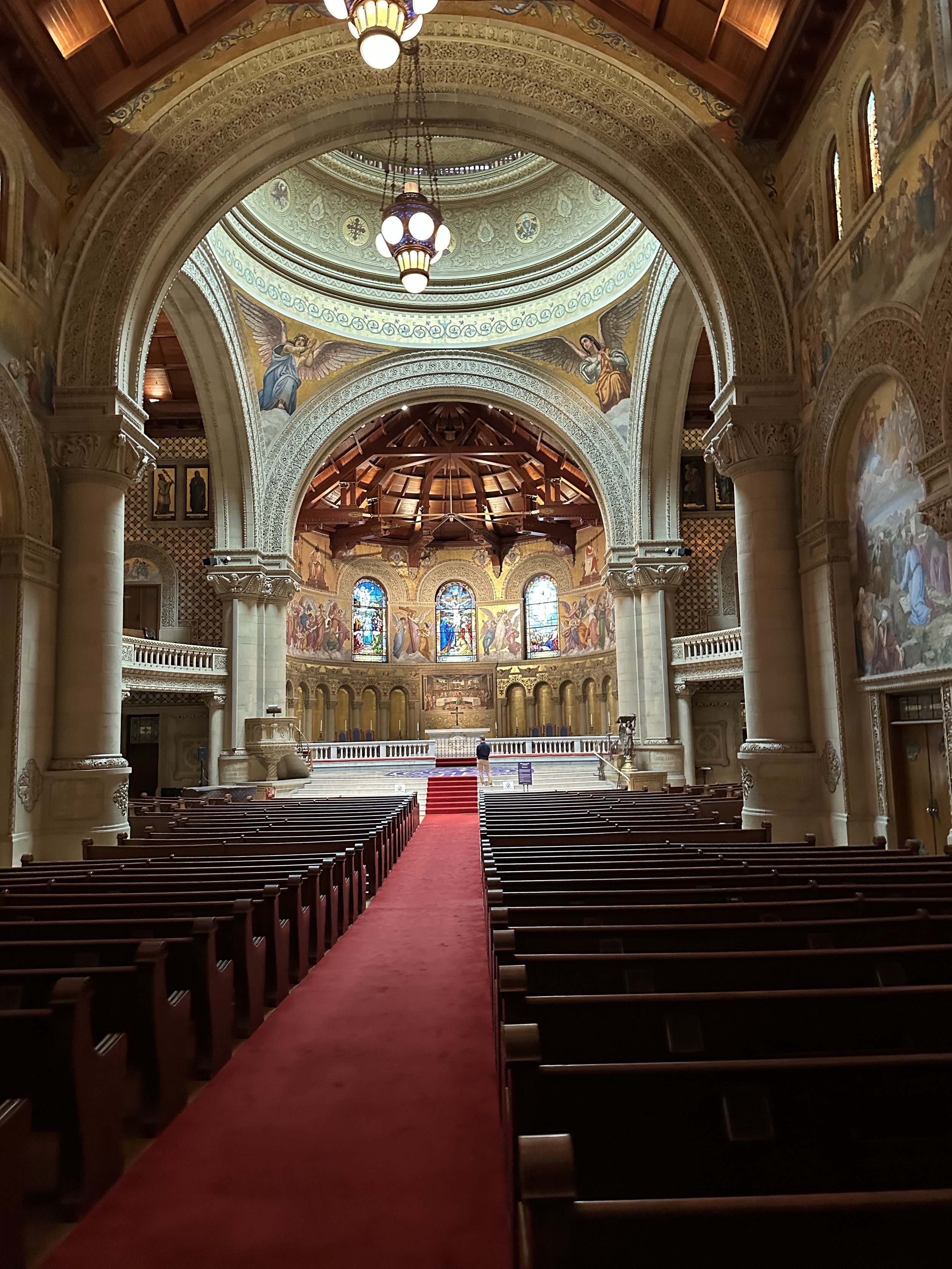
We began our tour of the campus at Stanford Memorial Church, with beautiful paintings outside and within. The grand, delicately ornate arches are juxtaposed against large, wooden trusses that hold up the tall space.
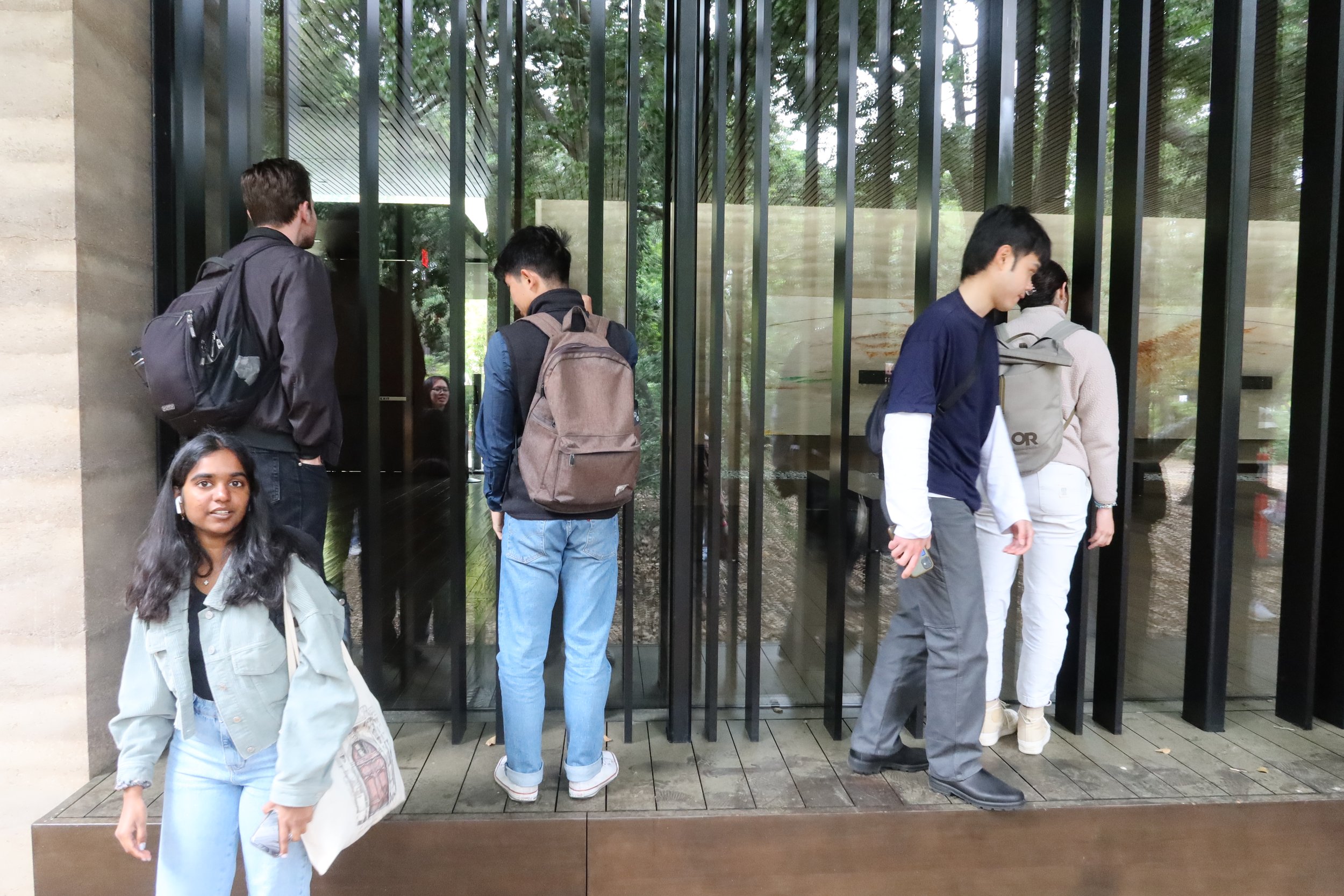
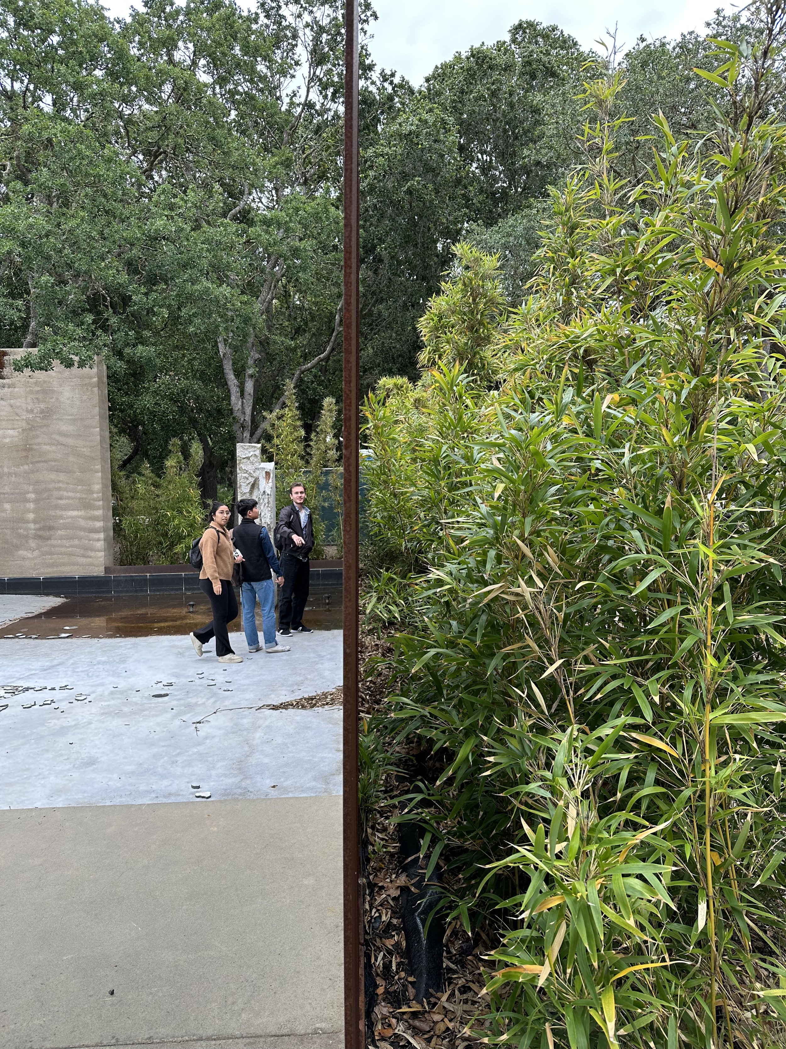
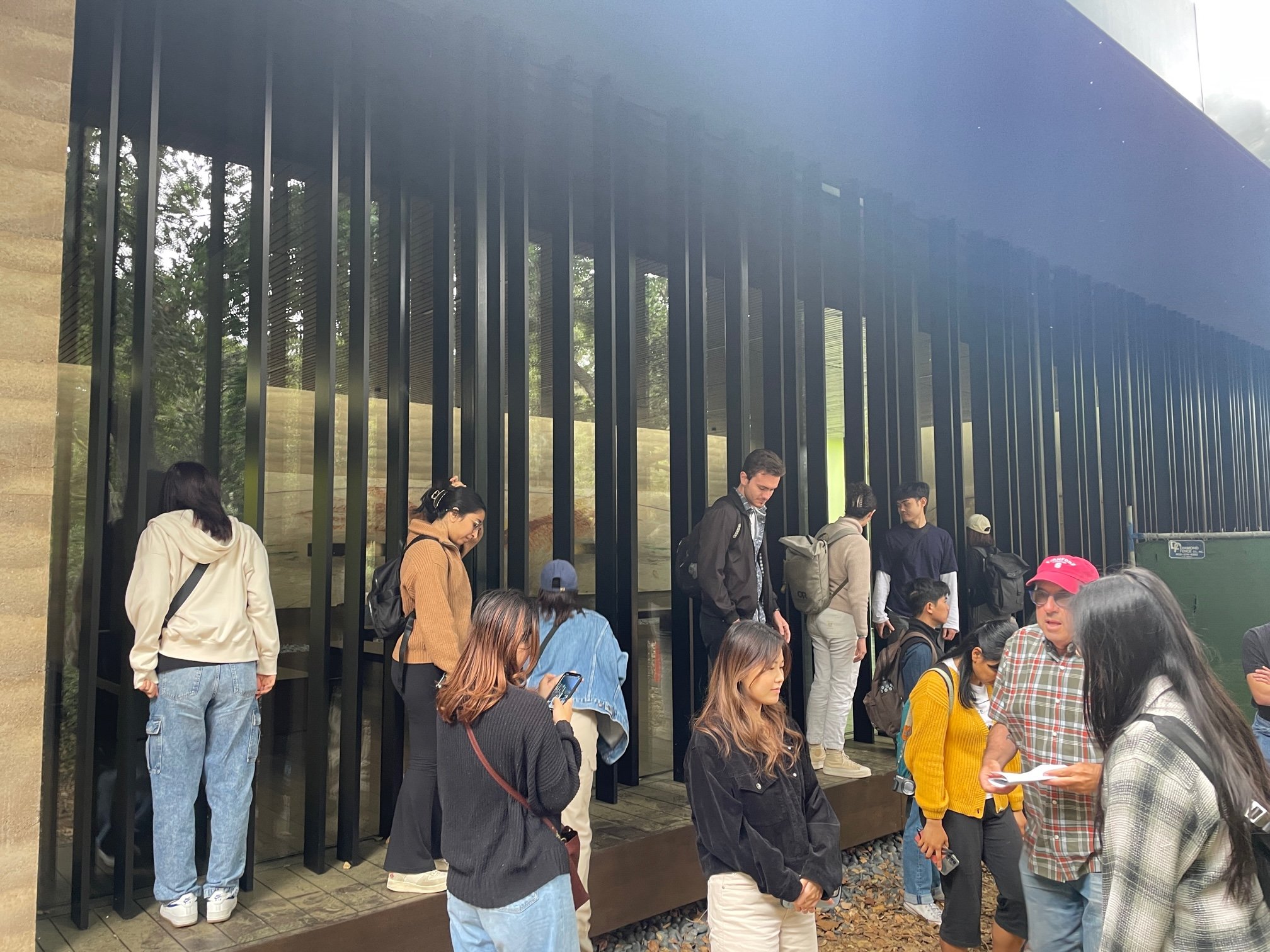
Following the church, we headed to Windhover Contemplative Center by Aidlin Darling Design—a firm which we were lucky enough to have been able to visit beforehand. Unfortunately, it was under renovation/repair, so the water feature was shut off. Although we weren’t able to go inside the building, its transparency made it easy to peek inside at the meditation space and see how peaceful it seems. We could only imagine how magnificent it looks when the pool is full.
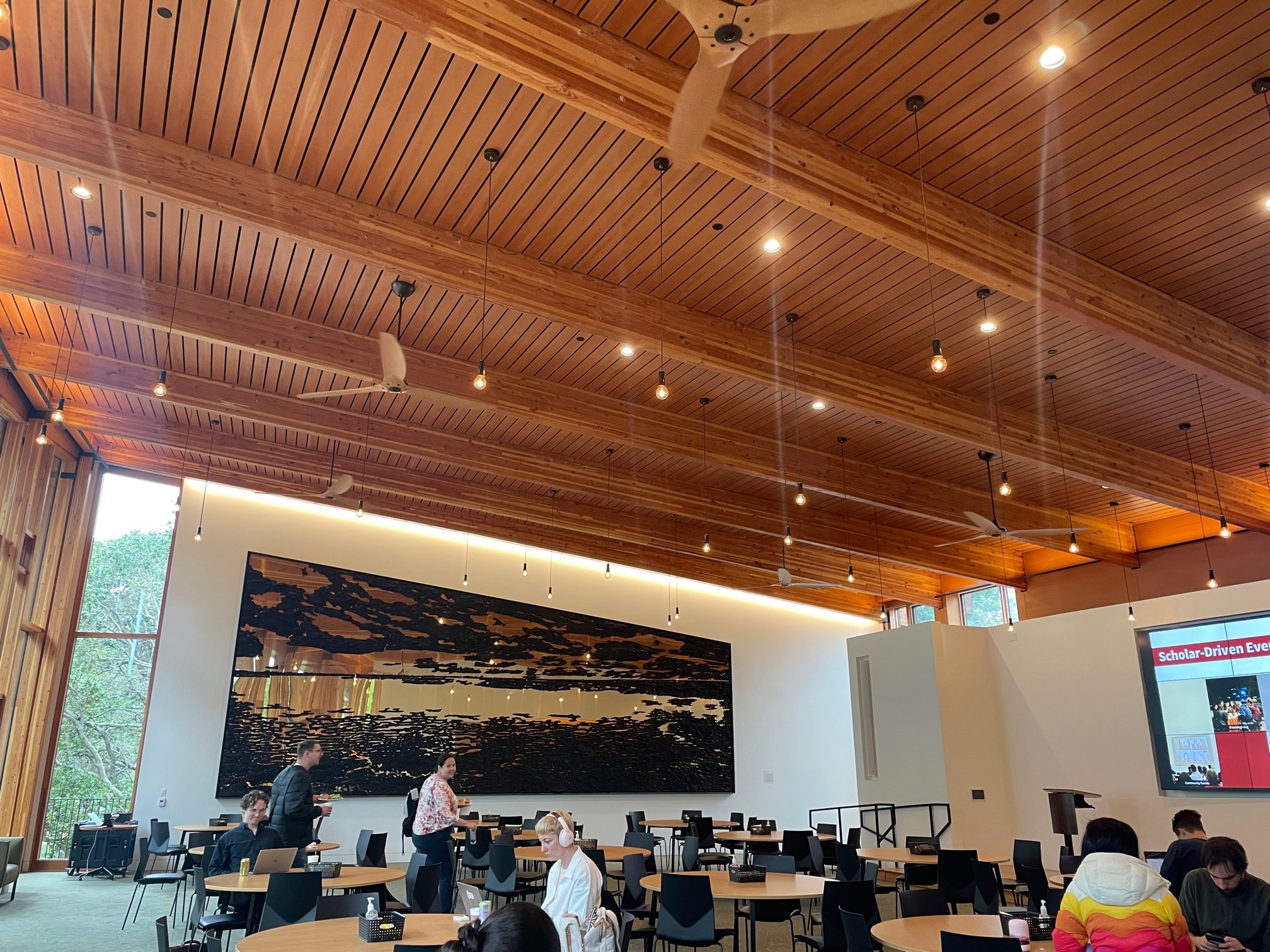
We were granted the opportunity to tour the Denning House, the center for the Knight-Hennessy scholars community overlooking Lake Lagunita, which features small-group spaces, a wrap-around deck, and a large dining room. The wooden facade, although quite costly and difficult to maintain in color (according to our guide), beautifully creates an intimate atmosphere, with the building nested within the trees. The building curves along the back where the wrap-around deck lies, and the subtly-patterned, floor-to-ceiling bird-friendly glass grabbed everyone’s attention.
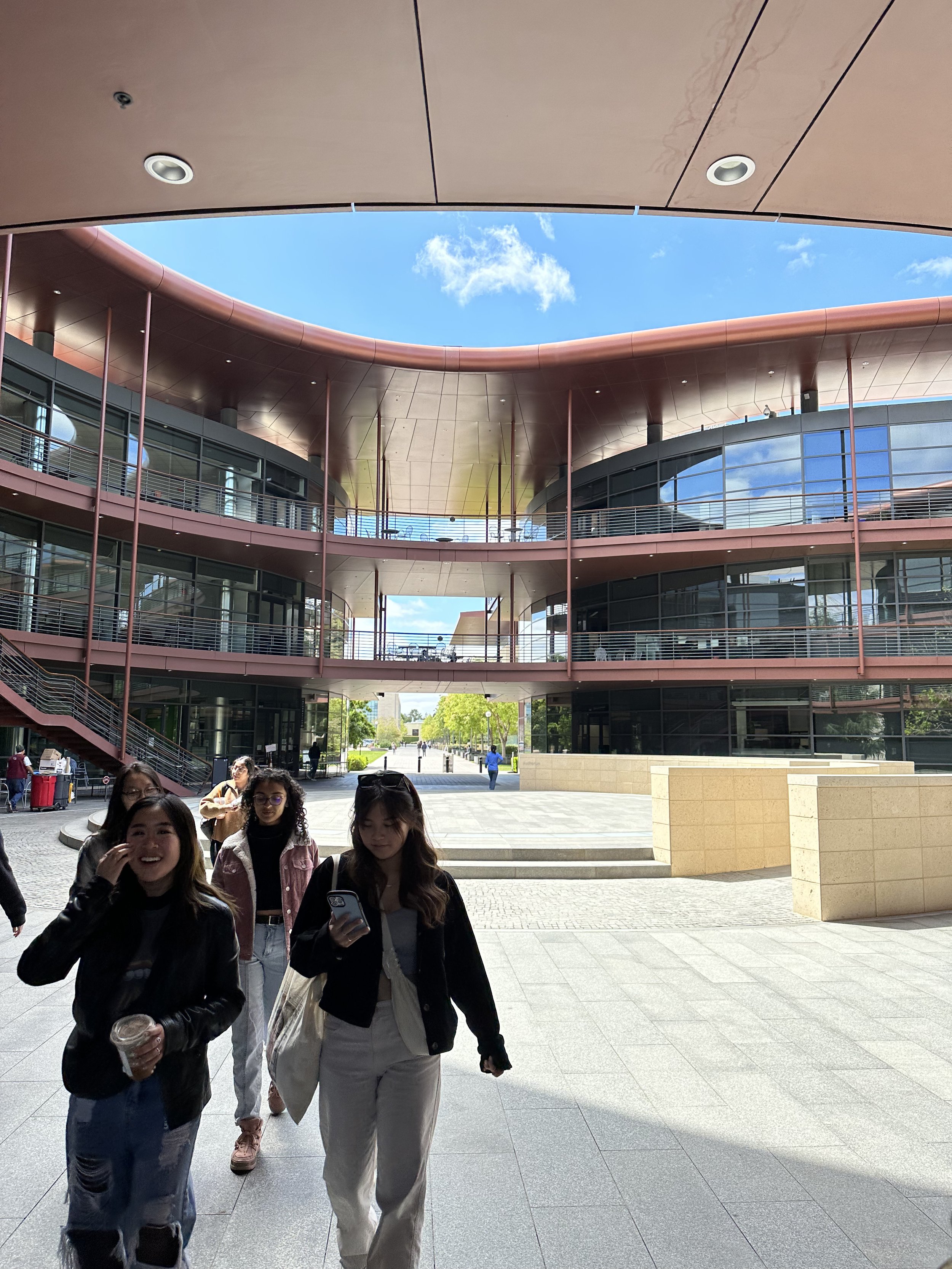
After lunch at Stanford’s food court and talking to some of the students, we made our way over to the ChEM-H Building and Neurosciences Building, whose parenthesis shapes envelop an oval courtyard in the center. The beautifully impressive all-glass facade lining the buildings proved to be a problem for birds and for overheating, according to our guide; however, it did create great views to the courtyard from within the building.
We then explored the Bowes Library rooftop deck, making our way through the campus’s beautiful buildings. The outdoor space was a great precedent for many of our rooftop outdoor spaces in our own projects, with seating and planters creating a better hierarchy of spaces.
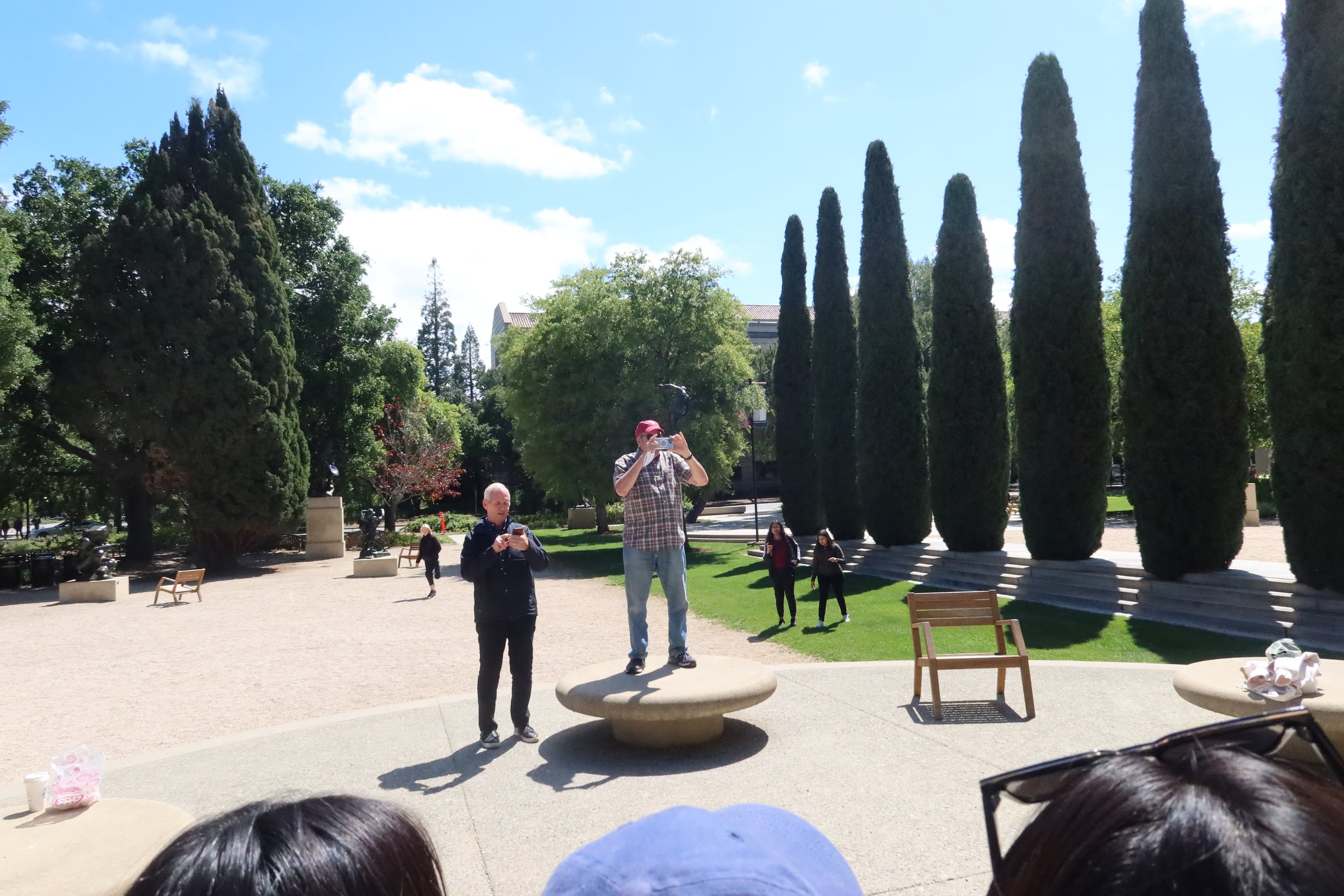
Afterward, we were given free time to explore part of the campus. Many of us went to see the Anderson Collection—a space dedicated to great, unique works of contemporary art. It was interesting to see how the architecture of the space further put the spotlight on the art and sculptures.
We left for San Francisco at 5pm. Overall, it was a great experience touring Stanford’s campus, and gave us all great inspiration for our own designs.
